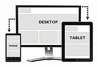

This is a test! The best way to make sure your Internet visuals are effective is to look at them on a small screen, like a smartphone as compared to your desktop monitor.
Think about when the billboard company would bring you a new design for your big board down by the busy highway. Holding the design in your hand, it looked pretty good but if you really wanted to measure the effectiveness, you stuck it on the wall across the office. That gave you the perspective of how a driver would see it and made it easier to detect any flaws.
In reviewing Home Page Graphics for a client recently I started on my big desktop monitor and they looked great. But after an interruption, I finished the process on my Smartphone and was amazed at how some of the most critical information was lost. It was too small, and not enough color contrast.
It seems like a small detail, but the statistics are showing clearly that more online shopping is done on handheld devices. And just like that billboard design that failed to convey your message, today’s online shopper is in an even faster lane.
Posted
John Paul Strong
John Paul Strong combines his two decades of automotive marketing experience with a team of more than 150 professionals as owner and CEO of Strong Automotive.


