
Times are changing. Technology is growing. Are you keeping up with all the changes? A better question is, how is your website keeping up with all the changes?
Nearly 60% of all Internet searches are made from mobile devices. Tablets and smartphones are the devices of choice when it comes to researching.
Search trends have turned to mobile traffic. How’s your website holding up to shift towards mobile technology? Let me give you six suggestions that will make your website more mobile friendly and make your brand message stand out.
#1 Mobile First Design
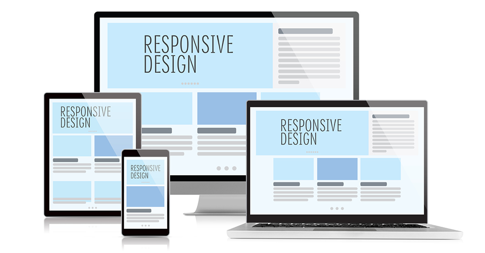
Ideally, you should design your dealership site to be mobile first. Many of your sites with responsive platforms, like Dealer Inspire or DealerOn, will scale from desktop to mobile seamlessly. Always view your website through a mobile device to ensure that your design is at its full potential. For those of you with an adaptive platform, Cobalt or Dealer.com, for example, will have to redesign or create new pages of your website in mobile view first and then switch to desktop. Regardless of your platform, make sure your navigation is user-friendly, and your call-to-action should be clear and JUMP OUT!

#2 Size Does Matter
Consider how your site will be viewed on a mobile device. Fonts, colors, and button sizes matter. Avoid black or other dark backgrounds with white text which causes strain on the eyes of clients viewing the website. Stick with lighter colors and use bright colors for your call-to-action. Use a font size of at least 12 pixels, so it’s easier to read on a mobile device. When it comes to buttons, bigger is always better. Make them easy to read and easy to click.
 #3 Bite-Size Content is Easier to Digest
Make sure content on your website and blog are bite-sized. Keep paragraphs short. This will minimize the amount of scrolling for a mobile site. By displaying only essential text, you are more likely to keep your customer’s attention. I suggest putting the vital information, call-to- action, and links above the fold on your page. If you need a lot more text, have your developers create accordion text forms that let users toggle through what they want to read. The same rules apply for forms on your site. Break up the form questions into bite-sized portions with large NEXT buttons to move your customer through the form.
#4 Break Up Your Pages
You need to break up a web page with pictures, quotes, and videos. Pages with only text are boring and cause an immediate exit from the page by any customer. Quotes that are prominent and stand out are a terrific way to break up the text and give your website some authority. To give customers a reason to believe in your content and your dealership, use quotes from reviews or your staff. Add visual interest to your page with high-resolution pictures and videos. Make sure you upload videos to YouTube. YouTube allows you to generate an HTML code to add the video to your website. This code is already mobile friendly and very responsive.
#5 Headers Tell the Story…
Not only do your content headers let Google know what your page is about, they tell the customer the most important points of the page. People don’t really like to read more than they should, so have your headers say what’s important about your web page.
#6 Page Load Time is Key
Keep an eye on web page load times. If your page isn’t loading in under 10 seconds, say goodbye to mobile users. Have your web or SEO team run a test, like Google’s PageSpeed Insights, to make sure your pages aren’t taking too long to load. You may have to remove pop-ups, resize videos or pictures to speed up the load time.

With customers mostly doing their searches on portable mobile devices, your website must reflect this growing trend if it’s going to compete in the market. Americans, abused by flashy graphics, meaningless pop-ups, and never-ending scrolling, now has the attention span of about 7 seconds. That’s less than a gerbil. (FYI, a gerbil has an attention span of 13 seconds.) By being more mobile-friendly, your website will stand out and reach its full potential when it comes to bringing in more traffic.
Posted

John Paul Strong
John Paul Strong combines his two decades of automotive marketing experience with a team of more than 150 professionals as owner and CEO of Strong Automotive.