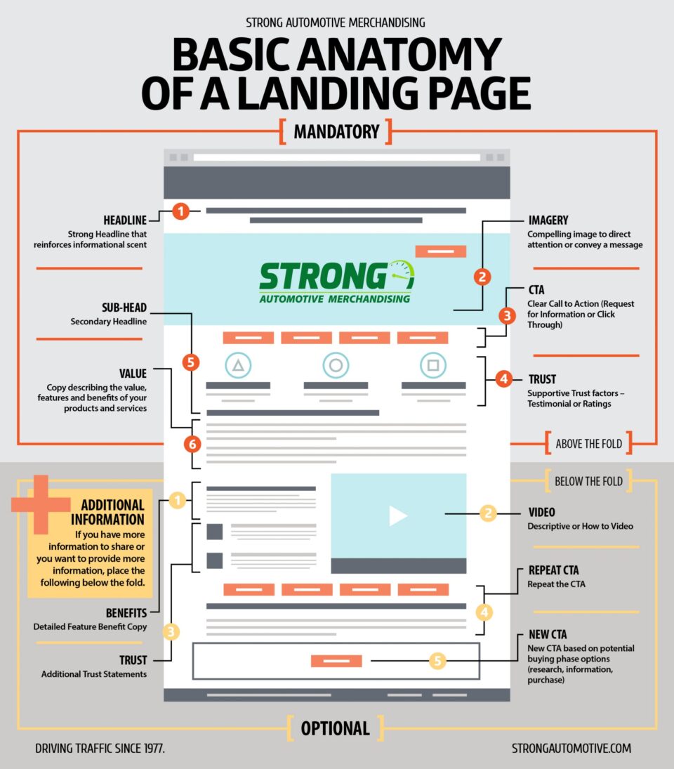

Enticing customers to click on an ad is only the first step in converting an online shopper. If you don’t have a well-built landing page to lead them down the rest of the sales funnel, you are likely to lose their attention as quickly as you earned it.
In this issue, we will explore the four categories of items you should be looking for when building or evaluating a landing page.
Page Design
A landing page is different from other pages on your website. For one, it needs a design that encourages action.
The page needs a short list of features and benefits of the products or services that you are offering. It must include quality, relevant, original images or videos that show the product in use. If there are people in your pictures, they need to be natural, believable photos rather than unrealistic stock photos. It is important to use visual cues to lead the customer, and to make sure that the call-to-action is visible from 6 feet away.
Content Simplicity
Keeping your content strategy simple is the best way to avoid inundating customers with information and solicitations.
First, the landing page needs to have a single purpose: leads or click-through. Make sure that the headline matches the message on the ads and that it answers the question, “What is this page about?” Having a simple, secondary subheading will enhance your headline further. Next, make sure that the average consumer can understand your page in 10 seconds or less. Refrain from requesting unnecessary information in your contact form, and keep your call-to-action incontestably clear.
Psychological Appeal
Understanding psychological factors that motivate consumers will guide your content and design strategy to become more effective.
First, ensure that the page is about the consumer, not you. When writing, infuse a natural sense of urgency into all of your copy and calls-to-action. The page copy needs to focus on the customer’s pain points and how your product solves their problems. To appeal to customers’ reciprocation reflex, make sure to offer something of value in exchange for the customer providing their information. Incorporate social proof like testimonials and reviews, and up your ethos by showcasing certifications, awards, and partner logos.
Related reading: States with the Highest and Lowest Cost-Per-Click for Search Ads
Technical Components
Without a well-programmed site, even the most convincing copy and illustrious images are rendered useless.
Start by ensuring that your landing page is optimized for the maximum paid search quality score. Next, remember to speed test the page before launching, embed trackable links, and view your page on mobile devices.
At Strong Automotive Merchandising, our digital clients’ landing pages are designed in-house using the rigorous standards outlined here, along with many more strategies and tactics. If your landing pages are lacking, call us today to start driving traffic online and into the dealership.
Posted
John Paul Strong
John Paul Strong combines his two decades of automotive marketing experience with a team of more than 150 professionals as owner and CEO of Strong Automotive.


